Recommended Videos
The Nintendo DS box art for Final Fantasy IV looks swell. Really swell. It might even be the best looking box for Final Fantasy IV out there, but the Japanese Playstation box art looks sweet too. I can’t decide. Maybe you can?
Take a look at the history of Final Fantasy IV’s box art past the break. Quick trivia: With the addition of the DS version Final Fantasy IV appeared on five systems. That’s a lot of Kain!
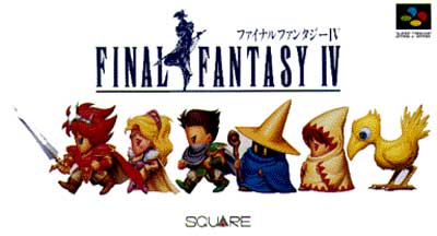
Super Famicom
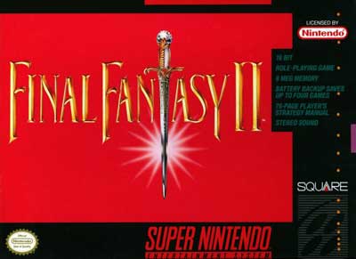
Super Nintendo
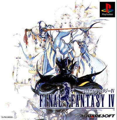
Playstation (Japan)
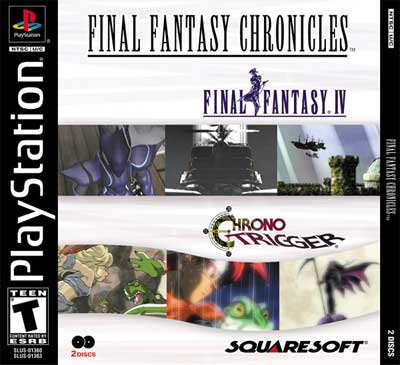
Playstation (USA)
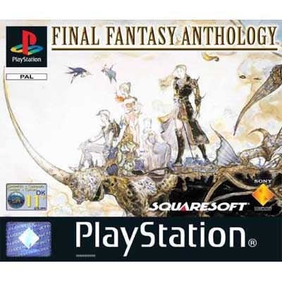
Playstation (Europe* technically this is FFV, but is how Europe got FFIV!)
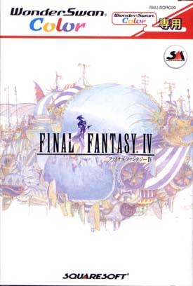
Wonderswan
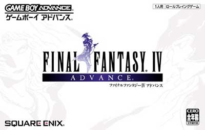
Game Boy Advance (Japan)
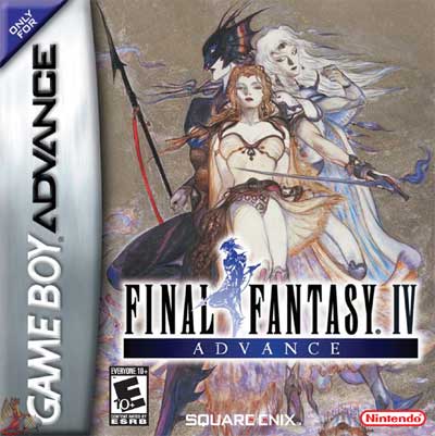
Game Boy Advance (USA)