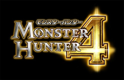
Logos. Who really looks at them? Game designers do. Actually, everyone does, and they’re important. They need to be eye-catching and convey the feel of your game. Dengeki sat down with director Kaname Fujioka to chat about Monster Hunter 4 leading up to the game’s launch, and among the topics covered was that of the game’s stylish new logo. For comparison, here are Monster Hunter 3 and Monster Hunter 4’s logos side-by-side:
![]()
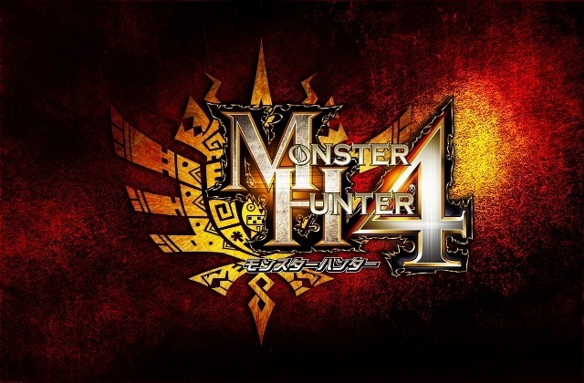
Fujiaka says that, in line with the new features introduced in the latest Monster Hunter, such as verticality during fights, he wanted to convey a sense of the changes while staying close to the core of the series. Up till now, the logos for Monster Hunter games have been “tightly composed,” Fujioka said, but Monster Hunter 4’s “M,” “H” and “4” have been made intentionally larger, creating a larger silhouette presence to provide a sensation of depth on top of the familiar design. “It still feels like Monster Hunter,” said Fujioka, “But there’s still a sense of something new about it.” 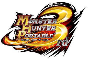 Previous Monster Hunter logos have used colors to represent themes. For example, the red in Monster Hunter Portable 3rd’s logo was chosen to represent harmony, and the ambience of Japan—or more precisely, the red from Japanese laquerware—also appears in Yukumo Village’s red foliage in that game. In comparison, Fujioka says, Monster Hunter 4’s theme is freedom and a sense of adventure. In the game’s story, this is represented using the flow of the story and the caravan. For the first time in a Monster Hunter title, players aren’t anchored to a single village, as Monster Hunter 4 has multiple villages. These, too, influenced the game’s logo, along with areas in the game. The first field you see in Monster Hunter 4 is a field of ancient ruins. Even here, you get the feeling of adventure through the immense vastness and openness of the area, in addition to the yellow grass extending into the distance. This field of yellow and the yellow of the “Village Under the Sun,” Barubare, were incorporated into the logo along with an arrow-like sillhouette that gives the impression of release or freedom. One thing’s for sure—Monster Hunter 4’s final logo certainly looks a whole lot better than the one Capcom showed off two years ago, back when the game was revealed by Nintendo: